Overly Stimulated In A Visual World
In a world full of print media it is so easy to forget how important and impactful visual communication is to society. As consumers we walk through life and can so easily tune out the billboards, bus stop ads, and commercials we see daily because when we consider communication we tend to think of it as verbal or oral. Visual communication is a crucial tool in delivering messages to consumers. Almost anyone on the street, regardless of if they're an automobile enthusiast, can identify a BMW or a Dodge vehicle seeing only the logo.
Visual communication elicits a response in people requiring them to use personal interpretation and critical thinking to decipher the message contained within a logo or advertisement. The room for interpretation is why it is so impactful and so many people respond to it over other types of messages. It allows consumers to asks questions like “what were they thinking when they made this?”
The building blocks of visual communication can range from text or color to symbols. Color is an imperative tool when trying to convey a message visually. Color theory associates colors like yellow and orange with hunger while red is connected to passion. So the Wendy’s logo designer made those color choices to make consumers “passionately hungry.” Purple is a color that is associated with nobility and bright yellow represents loyalty or joy. It makes sense why Hallmark and Crown Royal use those colors and a crown symbol in their logos as they are trying to stand out as above the competition.
There are countless examples of strong visual communication from individuals, brands, or companies so a compiled list could go on ad infinitum if it was being assembled. Three prime examples are the artists Matt Gondek and Buffmonster, and the company Nike.
Matt Gondek is an artist whose work typically contains brightly colored images of cartoon characters being disintegrated. His use of bright colors gives his work a playful feel while the imagery is in essence his destroying his childhood. He manages to make the death of youthful innocence so poignant and attractive. His style is uniquely his own making his visual communication exemplary.
")
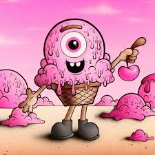
Buffmonster is another pop artist whose work centers around cartoon ice cream cones that he has lovingly named the melty misfits. His work is a nod to the Garbage Pail Kids trading cards and his use of color much like Gondek creates an inviting, innocent, and playful feel to his paintings. The most poignant part of his work are his characters where ice cream can be viewed as a metaphor for life and how it is important to strike while the iron is hot and not to wait too long for the perfect time cause opportunities can easily “melt away”.
Finally Nike is a brand that managed to create an empire around one of the most simplistic logos there is, a black swoosh. The elegant ark of their logo symbolically represents the perfect pass in a game of football, or a motion the net makes in a game of basketball when a flawless shot is made from behind the three point line. The use of black and white is also reminiscent of a referee jersey solidifying the affiliation to sports.

These are just a few examples of building blocks and brands to consider the next time you see an example of visual communication, be it an ad on the bus, or a billboard on the highway.

Comments
Post a Comment