Checking the organ donor box on your drivers license isn't something to be afraid of...
For the purpose of the brochure project our group decided to approach the topic of blood, organ, and tissue donation by creating a series of brochures for ConnectLife. ConnectLife is a local blood, organ, eye, and tissue donation center. It is Western New York’s only community blood center and federally designated organ, eye, and tissue procurement agency. They work to save and enhance lives through the support of their donors. Although a majority of people understand what it means to be a donor, there are still myths and misconceptions circulating with regards to the process of blood, organ, and tissue donation. Therefore, it is important to inform people about what it means to be a donor, the process, and show them how it can make an impact on not just the recipient, but also their friends and family.
The most effective way to visually communicate this message is through simplicity. Obviously, there will be a deliberate thought process behind the information layout, but the most important thing to do is keep a series of brochures, like theses, visually clean and easy to understand. When someone reads about ConnectLife, they are looking to figure out what services are being provided and how to reach out to the organization. Visually speaking, this can be communicated through the use of the organizations logo and spot colors, all of which we have access to. We can also use written text that stands out to label sections of the brochure alongside pictographs created in illustrator to signify specific information. The use of clipart syringes or bandages to symbolize a medical brochure isn’t what grabs the attention of people anymore. A serious, simple, straight to the point brochure that uses similar color schemes as the organization will speak to an audience who are actually interested in learning more about ConnectLife.
The topic of organ, blood, and tissue donation can at times be taboo but is something extremely important when it comes to preserving human life. It is also a relatively easy way to give back to one’s community which is extremely important. Our group believes that by creating a series of brochures that use a color scheme that is cohesive to ConnectLife as an organization, utilize varied repetition of simple linear elements, and employs the use of pictographs we can create a strong series of brochures. The goal of these brochures will be to help educate the public on the importance of being a donor, the services ConnectLife has to offer, and how they can get involved. We believe that our treatment of such an important topic is an effective visual strategy for a worthy cause.
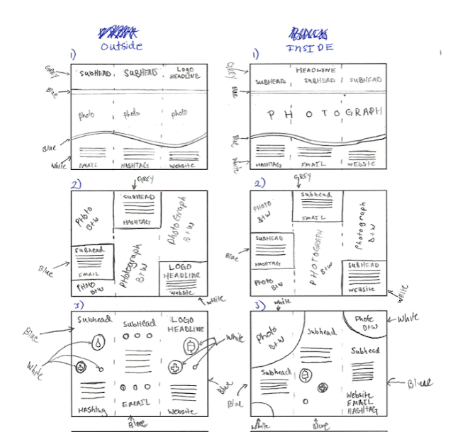
Thumbnails for potential designs pictured below:
Final Thumbnails:
Jake:
John:
Lauren:
Lauren:
John:
The black and grey boarders around them are just because of the screenshots taken in order to easily post them. The font selected is in accordance with their branding guide as are all the major white, blue, and grey color choices. The red, pink, and yellow are the companies secondary colors in their branding guide as well.


This is a great topic (typo, second paragraph, second sentence “like theses” should be “these”), also avoid having any commentary in the first person (closing sentence starts with "we believe..,”). Assumption that the brochures are three part? With one student designing one for organ donation, the second student designing for tissue donation, and the third student designing for blood donation? If so, each student may get started on their three thumbnails due for Wednesday morning. Friendly reminder: EACH student is designing THREE brochures - keeping in mind to use the thumbnail guide (PROJECTS / BROCHURE / GROUP PROJECT / COM322_BROCHURE_THUMBNAIL_SPECS.pdf)
ReplyDelete